The guest journey
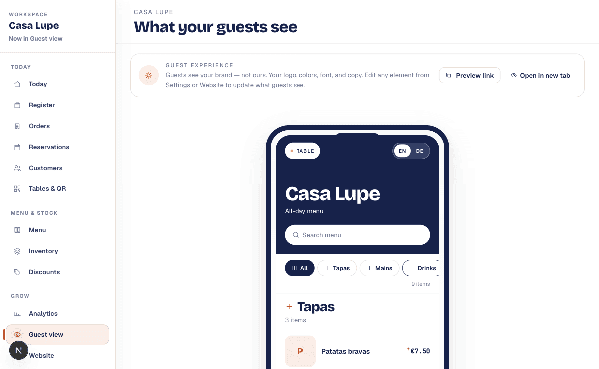
Scan, browse, order, follow the order, and pay at the appropriate moment. The transitions matter as much as the individual screens.
01 / Vividish
Menus, guest ordering, and restaurant operations, built as one connected product.
The project
A menu is where a guest starts. A restaurant has to keep working after the guest taps an item. Vividish brings the public experience and the operational work into the same product: ordering, reservations, customer context, menus, and the language that guides each step.
My work moves between interface design and the systems underneath it. A payment button depends on an order state. A reservation slot depends on a second check at submission. A useful customer screen depends on knowing when a feature should stay out of the way.
The early work lived in a POS project called Scanwich. The journal follows that lineage into Vividish, keeping each story tied to what was requested, implemented, or still unresolved at the time.
Scan, browse, order, follow the order, and pay at the appropriate moment. The transitions matter as much as the individual screens.
Menus, tables, reservations, and customer records share state. I investigate the places where independent features create contradictory experiences.
AI assisted implementation, scoped data access, concurrent writes, bilingual copy, and visual reviews. The journal separates a proposal from a verified change.
8 chapters / 31 Jan 2026 onwards
One editing session, several different saving rules. How I worked with an AI coding assistant on a restaurant website builder, and why the smallest status message needed a much closer look.
The AI produced five visual directions. I rejected the result because I needed something that belonged on a restaurant table.
The checkout integration was working its way into the wrong moment. I asked the AI assistant to follow the restaurant journey instead.
A blueprint and an implementation can both exist while still speaking different visual languages.
I asked a capacity question. The useful answer was a map of the order path’s weak points.
There were no duplicate guests to review. The interface still gave the restaurant owner a paragraph about it.
A fast availability check is only one part of a dependable booking flow.
I wanted English and German copy that helped restaurant staff act, not decode the software.
The working record
Original captures, visible details,
and room to look closer.