Let me order dinner before you ask me to pay.
The checkout integration was working its way into the wrong moment. I asked the AI assistant to follow the restaurant journey instead.
I wanted someone to place an order and know that it had gone through. Instead, the flow moved straight into Stripe.
For the dine in experience I was building, that was the wrong next step. Confirm the order. Let the food arrive. Then make payment available, even if the guest comes back by scanning the table QR again.
See the original requestInside the screen
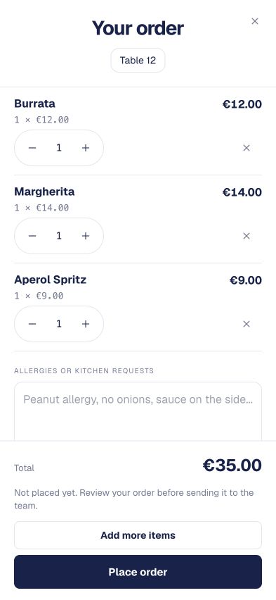
The cart has not sent the order yet.
The useful detail is the relationship between the status sentence and the action beneath it.
Select a detail
Order not placed yet removes an ambiguity that a total alone cannot resolve. Adding food to a cart is not the same event as sending it to the restaurant.
Place order describes the immediate action. I want the interface to be equally clear about any payment step that follows, rather than let one button imply several different commitments.
Later development fixture. It demonstrates this visible cart state, not payment processing or the exact February interface.
The original request1 Feb 2026 · excerpt
when a person orders, it should not take them to stripe instantly, it should just show order confirmation and once the order is delivered, only then it should show them the pay now link when the user scans
Excerpted from the development conversation. Punctuation is lightly edited; the surrounding story is an edited retrospective.
01
The integration had started deciding the experience.
The conversation immediately before my request was about connecting restaurant payments. That was necessary implementation work, but it did not answer when a guest should be asked to pay.
A checkout integration has a natural endpoint: open checkout. A restaurant visit has a different sequence of events. I needed to stop the technical path from quietly becoming the product journey just because it was available.
So my prompt named the behaviour in human terms: no immediate redirect, show confirmation, and offer payment once the order has been delivered. This was a choice for the dine in flow I was building. It was not a claim that every restaurant, pickup order, or service model should collect payment at the same moment.
02
“Place Order” needed to mean place an order.
The assistant changed the cart action to Place Order and routed submission to the confirmation page. The button and the next screen now described the same step.
That is a small change with a useful consequence: a guest does not have to interpret an unexpected payment screen to understand whether the order exists. Confirmation can acknowledge the action they just took and become the place to follow what happens next.
The implementation was spread across the cart, the menu page, and the order confirmation page. That matters to how I work with AI tools. The request was one sentence about the experience; the answer had to make several parts of the application agree about that sentence.
Inside the screen
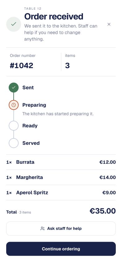
Confirmation leads into progress.
Once the order is sent, the screen has a different job: explain what the restaurant is doing next.
Select a detail
Order received tells the guest that the placement step completed. I want that confirmation to describe a known event, not borrow the language of a payment receipt.
Sent, Preparing, Ready, and Served separate the order journey into recognisable stages. Each state needs a real event behind it before the interface can be trusted.
Later fixture with sample order data. These stages do not prove a payment integration or a live kitchen event.
03
One order has more than one kind of status.
The payment action became dependent on delivery and payment state. A delivered order that was not paid could show Pay Now. If payment was already pending, the action was disabled and the interface said Payment processing. Payment errors stayed on the confirmation page.
Those conditions answer different questions. Delivery tells me where the restaurant is in fulfilling the order. Payment tells me what has happened to the money. I should not collapse them into a single vague “complete” state.
A paid order should not invite another payment. A pending payment should not look like nothing happened. An order that has only just been placed should not be presented as though its meal has already reached the table. The interface becomes clearer when each message describes the state it actually knows.
Explore the decision
Same order. A different next step.
Move through the states to see why one payment button cannot describe the whole visit.
- Delivery
- Waiting for delivery
- Payment
- Unpaid
And on the next scan?The delivery condition is not met yet. The payment banner stays out of the way.
04
The second scan was part of the first request.
The last part of my prompt was easy to miss: show the payment link when the person scans. I was thinking about someone returning to the menu, not only someone who kept the confirmation screen open the whole time.
The menu therefore gained a lookup for delivered, unpaid QR orders and a Pay Now banner leading back to order confirmation. Scanning again did not automatically throw the guest into Stripe. It brought the relevant next action back into view.
This is the detail that connects the screen to ordinary use. People set their phones down. They move between the table, the conversation, and the page. The product should not depend on everyone preserving one perfect browser session from ordering to paying.
05
A disabled button is useful. It is not the whole safeguard.
The assistant explicitly said tests had not been run in that pass. It also proposed a payment pending guard in the checkout route to prevent duplicate sessions. That proposal is a meaningful boundary around what had been completed.
Disabling an action on the page can reduce accidental repeat taps in that interface. It does not prove the server will reject every duplicate attempt, or that another tab cannot make the same request. I would not turn one disabled button into a claim of end to end payment safety.
Looking at the flow now, I would check both ways of reaching payment: remain on confirmation, and leave then rescan. I would also check pending, paid, failed, and repeated attempts. That is a concrete verification plan derived from the states in the implementation. It is not a test report from February.
06
The point was to remove an interruption.
The recorded implementation replaced the immediate checkout redirect with confirmation and made payment available at the requested stage. It also handled the guest returning through the table QR. That is the specific progress I can stand behind.
The improvement I was aiming for was simple: acknowledge the order, let the meal proceed, and make the next action available when it belongs. A restaurant visit should have room for the restaurant visit.
Working with AI tools lets me move quickly from that intention into code. My job is to keep asking whether the code still follows the person. In this case, the most useful change was deciding not to open the perfectly available checkout screen yet.
07
Look at the promise immediately above the button.
The later component capture makes one useful detail tangible. Above Place order, the cart says the order has not been placed yet. On the status screen, the language changes to Order received. Those are two different promises to the guest. I want a person to know when they are still editing a basket and when the restaurant has something to act on. Otherwise a polished transition can leave them wondering whether to tap again.
These September screens come from the real cart and status components running with fictional order data. They show how I can inspect wording, item quantities, totals, and the next action in isolation while working with AI. They do not exercise a restaurant transaction or prove the February payment rules. For that, I would still need to follow the same order through delivery, a second menu scan, payment initiation, and a confirmed paid state. Each visible promise needs its own check.
Both flows separate a tentative choice from a committed action. I return to that question in A reservation rule has to survive the final click.
Where this chapter landed
What changed.
The guest remained on order confirmation after ordering. Delivered, unpaid orders exposed payment, pending payments showed processing feedback, and rescanning could bring the payment action back. The original response did not report tests, and the proposed checkout session guard remained a follow up in that record.
Added while revisiting this story · September 2026
The thinking behind the detail.
Research notes to take these decisions further. These sources were reviewed for this retrospective.
A redirect does not confirm a payment
Stripe’s documentation explains why payment handling must not rely only on a browser reaching a return page: someone may pay and lose their connection before that page loads. Server side events and payment status need to establish the result; repeated event handling must be safe. This supports separating navigation from payment truth. It does not imply that these safeguards were all implemented in the February change.
Keep the person informed in each state
W3C’s form guidance calls for clear success and error notifications. Applied here, order confirmation, payment processing, and payment failure deserve distinct feedback. These are useful review criteria, not evidence of a completed accessibility audit of the original app.