A week of availability, painted in a few gestures.
The app had already filled in my schedule. Editing it was the hard part.
I was setting my availability, and the app had already decided what parts of my week looked like. The times came preconfigured. Editing them was not obvious. That is a strange way to ask someone about their life.
The household needed a rough picture of when someone was around. I did not want to turn that into another calendar people had to maintain. My request was much smaller: “say paint your week”.
See the original requestInside the screen
The week becomes a surface to edit.
I can see the appeal of painting availability, and I can also see a detail that needs attention at this width.
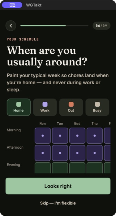
Select a detail
Home, Work, and Out give the colours a meaning. I want the labels to remain available while a person paints, because colour alone should not carry the entire instruction.
The grid puts the choice where its result appears. The screenshot shows the surface, while gesture handling still needs to be tested in the application.
The rightmost day is clipped in this capture. I would check horizontal access and whether the screen explains it. A compact layout is only useful if every day is reachable.
This July screen uses morning, afternoon, and evening rows. The May implementation described two hour slots, so this is a later interface, not an exact image of that earlier grid.
The original request21 May 2026 · excerpt
we only want to find out as QUICKLY as possible if the flatmate is home or not
Excerpted from the development conversation. Punctuation is lightly edited; the surrounding story is an edited retrospective.
01
A blank square is already telling people something.
Calling the grid blank hides a decision. In this flow, unpainted time means home. That saves a lot of input, but it also makes the explanation of the default part of the feature. Someone who reads blank as unknown could share a week that says more than they intended. I want the colour legend and the preview to expose the same meaning the scheduler will use.
The two hour cells are another deliberate simplification. I was trying to capture broad availability quickly, not build a competing personal calendar. More precision would require more effort to enter and maintain. The useful question is whether the household can coordinate with the information it gets. A finer grid would only be an improvement if it helped that job enough to justify the additional work.
02
Blank was a decision
Home became the default and erase state. Unpainted time counted as home and was not stored as a collection of explicit home blocks. That reduced the amount someone had to enter.
It also meant an empty grid carried an assumption. The colours and defaults needed to be understandable before anyone started painting. Saving fewer blocks is only useful if the person knows what the blank space means.
03
The pointer has to agree with the painted cell.
My corrections about selecting the wrong row or column are the detail I would put beside the screenshot. The visible grid and the gesture calculation have to describe the same coordinates. A finger moves continuously while the interface divides the week into discrete cells. If the hit area, scroll offset, or drag ownership is wrong, the person ends up repairing the application’s interpretation of a simple movement.
This is where I need more from an AI implementation than a screen that renders. I would start in one cell, drag across a boundary, reverse direction, and lift near the edge. I would also try tapping one cell without accidentally painting a neighbouring one. The initial record included simulator inspection and left physical finger testing open. The later July capture shows the real interface, not proof that those May gestures were already perfect.
Availability becomes useful when the scheduling rule consumes it correctly. I return to that question in Three people at home should not mean nine days of waiting.
Where this chapter landed
What changed.
Paint week onboarding was implemented. The initial record left physical device drag testing and reuse in schedule settings as follow ups.
Added while revisiting this story · September 2026
The thinking behind the detail.
Research notes to take these decisions further. These sources were reviewed for this retrospective.
A gesture has a lifecycle
React Native documents how views negotiate ownership of a touch gesture and how that ownership can change. That makes dragging across the weekly grid a behaviour to test on hardware, beyond checking the painted result in a still image.