One hat. Ten visual directions.
The product stayed the brief’s anchor. The light, setting, and role of the image changed.
I asked for ten distinctly different ways to present the same hat: some straightforward product shots, others with a setting and a stronger visual story. The useful experiment was in the differences between those images.
A close up, a catalogue image, and a campaign scene do different jobs. Treating them as interchangeable variations would miss the point of asking for ten directions.
See the original requestInside the image
Different images should do different work.
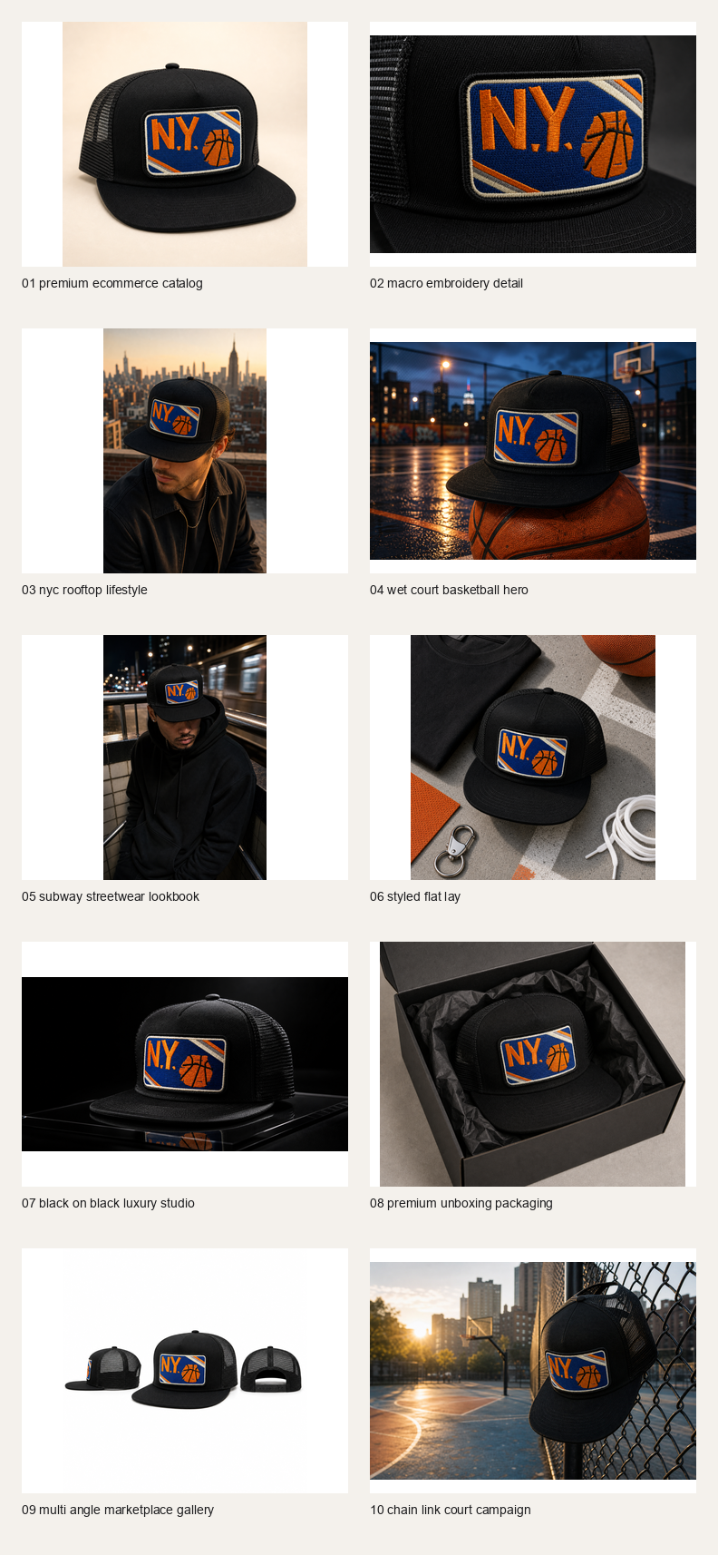
The first four outputs already separate inspection, material detail, lifestyle, and atmosphere. That is more useful than ten interchangeable hero images.
Select a detail
The catalogue view keeps distractions low. I would use this role when someone needs to understand the object before being asked to care about its setting.
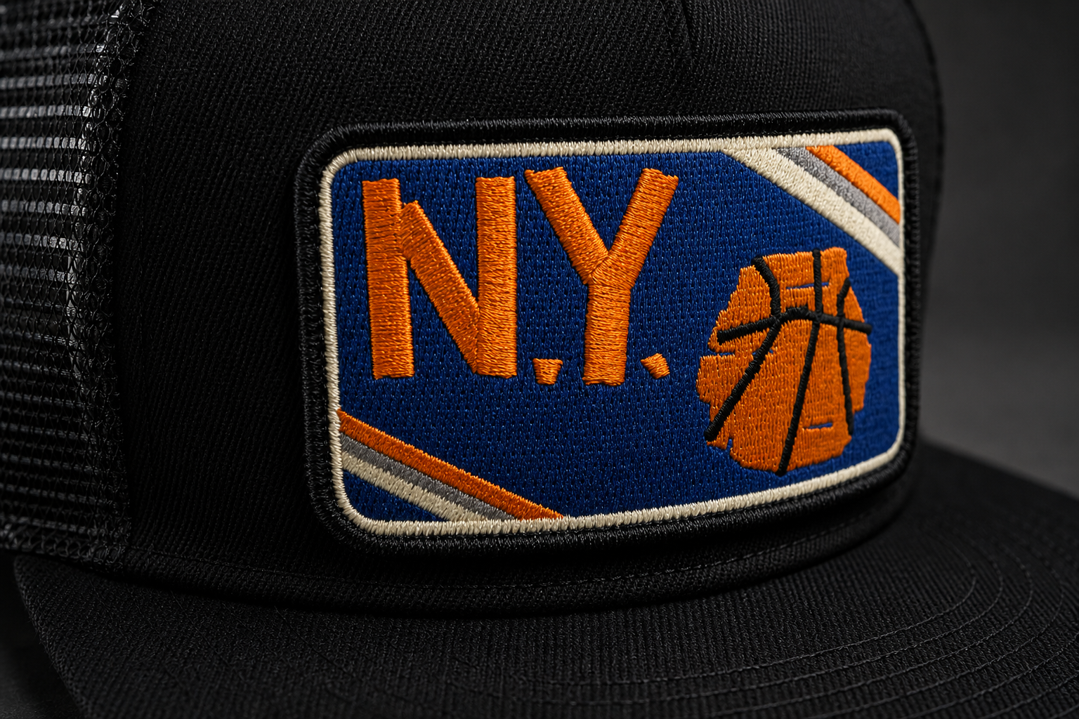
The macro view shifts attention to the embroidery. It earns its place by answering a different visual question, while still needing consistency checks against the other outputs.
The wet court introduces a scene and a colour relationship. It can carry a campaign mood, but it should not replace the clearer product view.
Original AI generated creative outputs. The visible fabric and stitching are generated depictions, not photographs or proof of a manufactured product.
The original request5 Jul 2026 · excerpt
think of also the location and bringing the feel of it in the picture along with few product shots
Excerpted from the development conversation. Punctuation is lightly edited; the surrounding story is an edited retrospective.
01
The contact sheet is where repetition becomes obvious.
When I look at a single generated image, atmosphere can distract me from whether it adds anything to the set. Ten images beside each other make that harder. If several frames use the same angle, distance, and lighting idea, they are competing for the same job. A macro and a wider location image can earn their places by revealing different information about the same object.
The original set makes that comparison possible. The embroidery study brings the surface forward. The court image lets the setting carry more of the mood. The catalogue treatment makes the product easier to inspect. I would choose between them according to where the image will live and what the viewer needs from it, rather than rank every image on one vague scale of beauty.
02
Keep an anchor while the context moves
The hat supplied the anchor. Framing, light, surface, and surrounding context could change around it. That creates a useful comparison: which image explains the product, which creates atmosphere, and which adds detail worth noticing?
The contact sheet makes those differences visible at once. Looking across the set is more revealing than judging each image alone, because repeated choices and weak variations become easier to spot.
Inside the image
A close crop raises the standard for consistency.
The closer I take the viewer, the easier it becomes to see whether the generated object holds together.
Select a detail
The embroidered mark becomes the focal point. Across the series I would compare its shape, placement, and colour, rather than accept a convincing texture as enough.
The edge and surrounding fabric give the emblem a physical context. Those transitions are where I would look for an image that feels plausible at a glance but breaks down on inspection.
Original generative image study, not a material sample or an actual product photograph.
03
The product has to remain itself while the scene changes.
With generative imagery, the context can improve while the object quietly changes. That makes continuity part of my review: the mark, proportions, material, and construction should be compared across the set. These images are concepts, so I do not present their details as verified manufacturing evidence. I use them to explore presentation and identify where the direction needs another pass.
My follow up asked for more realism and a stronger sense of place. That is a useful progression from the first brief. Once the ten directions existed, I could ask for a more specific quality instead of requesting ten more variations blindly. The original outputs remain visible here because they are the actual work of this experiment. Replacing them with newly polished images would erase the comparison that made the next request possible.
Changing the visual role is more useful than asking for another decorative variation. I return to that question in Five QR designs later, I rewrote the brief.
Where this chapter landed
What changed.
Ten AI generated product and campaign studies were saved, followed by a request for more realistic, context specific directions. The complete original set is available below.
Added while revisiting this story · September 2026
The thinking behind the detail.
Research notes to take these decisions further. These sources were reviewed for this retrospective.
Inspect composition through specific choices
Nikon’s composition article discusses light, colour, and gesture as ways to examine a photograph. I use those as review lenses for these generated concepts, without treating a generated frame as evidence of a physical shoot.