Making the navigation smaller made the collision worse.
The chat composer and the tab bar were competing for the same space.
The bottom navigation had become cramped. The reason was understandable: chat needed room for its composer, so the tab bar had been made smaller. But opening a different screen should not make the main navigation harder to recognise.
I asked for a practical review of how the two surfaces could work together. That changed the problem from “how small can the menu get?” to “which surface needs this space right now?”
See the original requestInside the screen
The bottom edge has several jobs.
Suggestions, message entry, and navigation all compete for the same small area. I need to review them together.
Select a detail
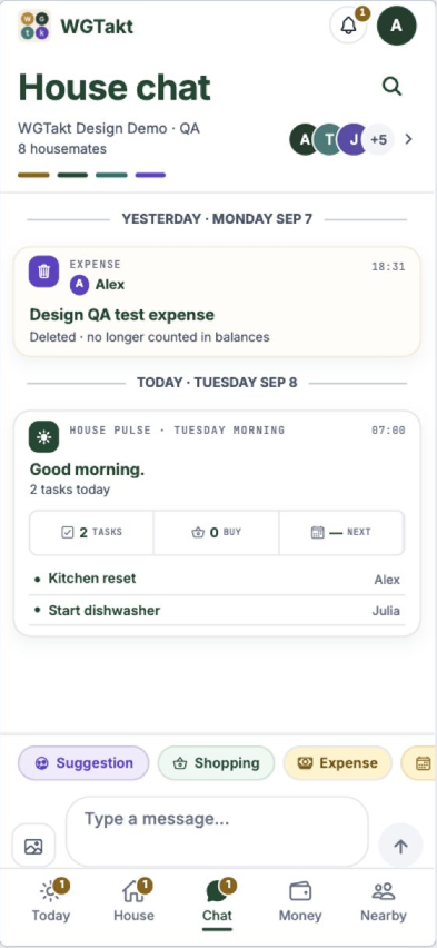
The chips sit above the composer. I would check how they wrap with longer wording and whether they remain reachable when the keyboard opens.
The composer and navigation occupy different bands. Shrinking the tab bar alone does not establish that touch targets, safe areas, and keyboard insets work together.
The unread badge adds another shape near the icon. It belongs in the overlap review, including at larger text sizes.
September browser development capture with demo chat. The keyboard is closed, so this image cannot prove the native keyboard collision is fixed.
The original request24 Jun 2026 · excerpt
The bottom menu has shrunken because we were trying to make it smaller when chat loads up
Excerpted from the development conversation. Punctuation is lightly edited; the surrounding story is an edited retrospective.
01
Opening chat is not the same as opening the keyboard.
That distinction was the turning point in the review. A person may open chat just to read what someone said, then move to their chores. Shrinking the primary navigation as soon as chat opens makes that ordinary path less stable. The keyboard creates a different spatial constraint, and the composer has a different responsibility while someone is typing.
I wanted the AI review to name those states before adjusting measurements. Otherwise it is easy to chase the collision through padding, icon size, and reserved bottom space, with each local fix making another part less predictable. The proposed behaviour kept browsing navigation consistent and treated active composition as its own state. That gives the implementation a clearer question than whether the tab bar can be made smaller.
02
Define the states before the dimensions
The proposed direction used stable states: normal navigation while moving between sections, and a focused typing state when the keyboard and composer needed the bottom area.
The important distinction was between entering chat and actively typing. They are not interchangeable. A chat screen can still need the same predictable navigation as the rest of the app before the keyboard appears.
03
A still image can only tell half of this story.
The September development capture shows the normal reading state with a full tab bar and demo household messages. It lets me inspect the relationship between the composer, navigation labels, and unread counts. It cannot show the keyboard transition, and a browser preview cannot establish native keyboard or safe area behaviour. Those are separate checks on the actual device.
My review sequence would open the keyboard, type, dismiss it, change tabs, and return to chat. I would repeat that with an unread badge and a longer message history. The aim is to keep the person’s place and next action predictable throughout the transition. The June conversation stopped at diagnosis and proposed behaviour. The later capture is a real implementation reference, not evidence that the recommendation shipped in June.
The shared home needs more than one polished success state. I return to that question in Signing up one person did not test a shared home.
Where this chapter landed
What changed.
The review identified compact mode navigation as the source of the collision and proposed stable browsing and typing states. This entry records the review, not a verified release.
Added while revisiting this story · September 2026
The thinking behind the detail.
Research notes to take these decisions further. These sources were reviewed for this retrospective.
Review the transition in sequence
W3C’s focus order guidance is a useful additional lens for the proposed browsing and typing states. I would check that opening or dismissing the composer does not leave keyboard users navigating controls in an unexpected order.