PROJECT / WGTAKT MOBILE APP
WGTakt mobile app
WGTakt became serious when Varun stopped treating chores as tasks and started treating the WG as a living system with rhythm, memory, and social pressure.
The bot logic became a native shared-home app with Today, House, Money, Chat, push actions, and community surfaces.
ACTUAL PROMPT / THREAD TRACE
The bottom menu has shrunken because we were trying to make it smaller when chat loads up... come up with a more practical way.
WHY IT MATTERS
The app is a product-design case study in turning invisible house labor into visible, fair, low-friction interaction.
HOW TO READ THIS
Each entry is a dated design decision: the pain point, the response, the proof source, and the visual artifact when the archive had one.
DATED JOURNEY
DATE INDEXThe app inherited the bot's best behavior
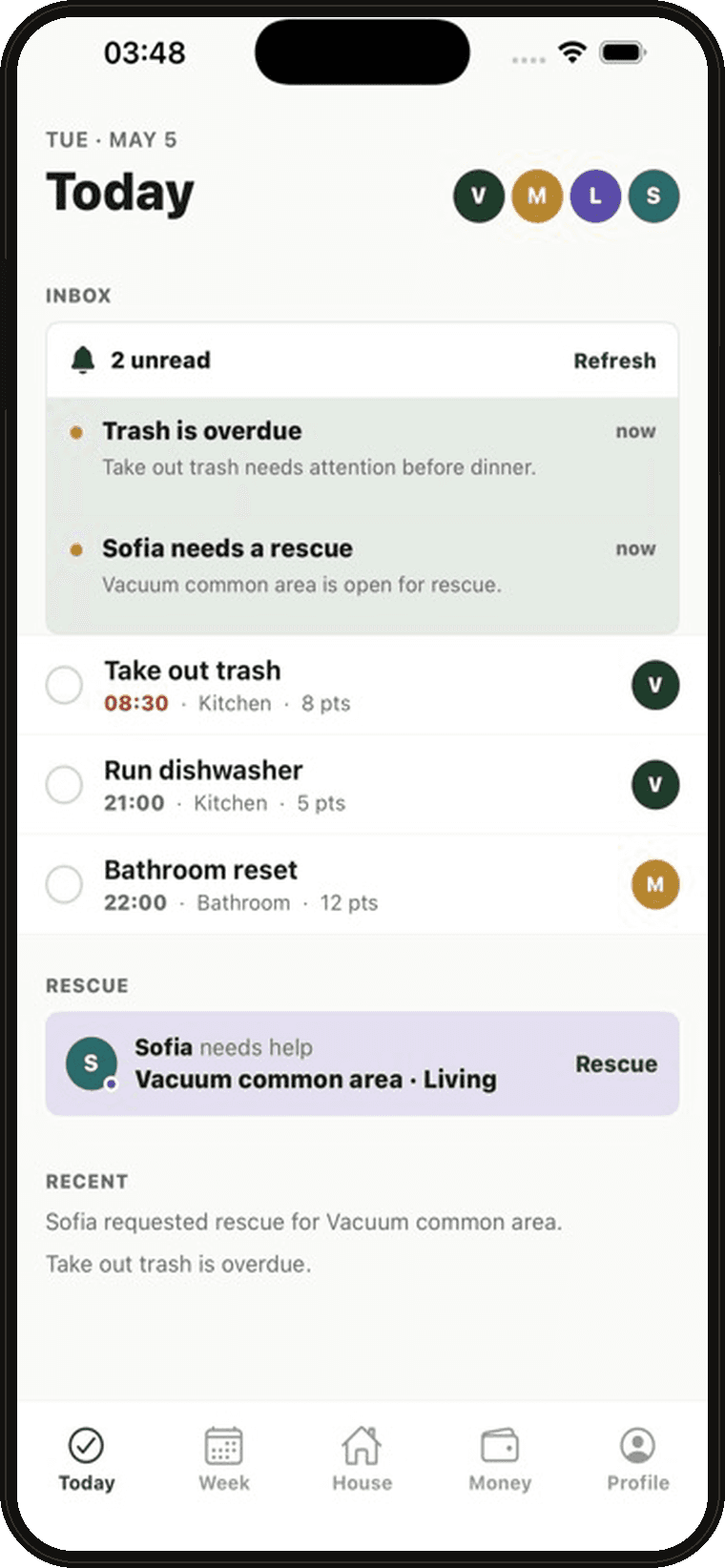
Today was not a to-do list. It was the house asking for attention.
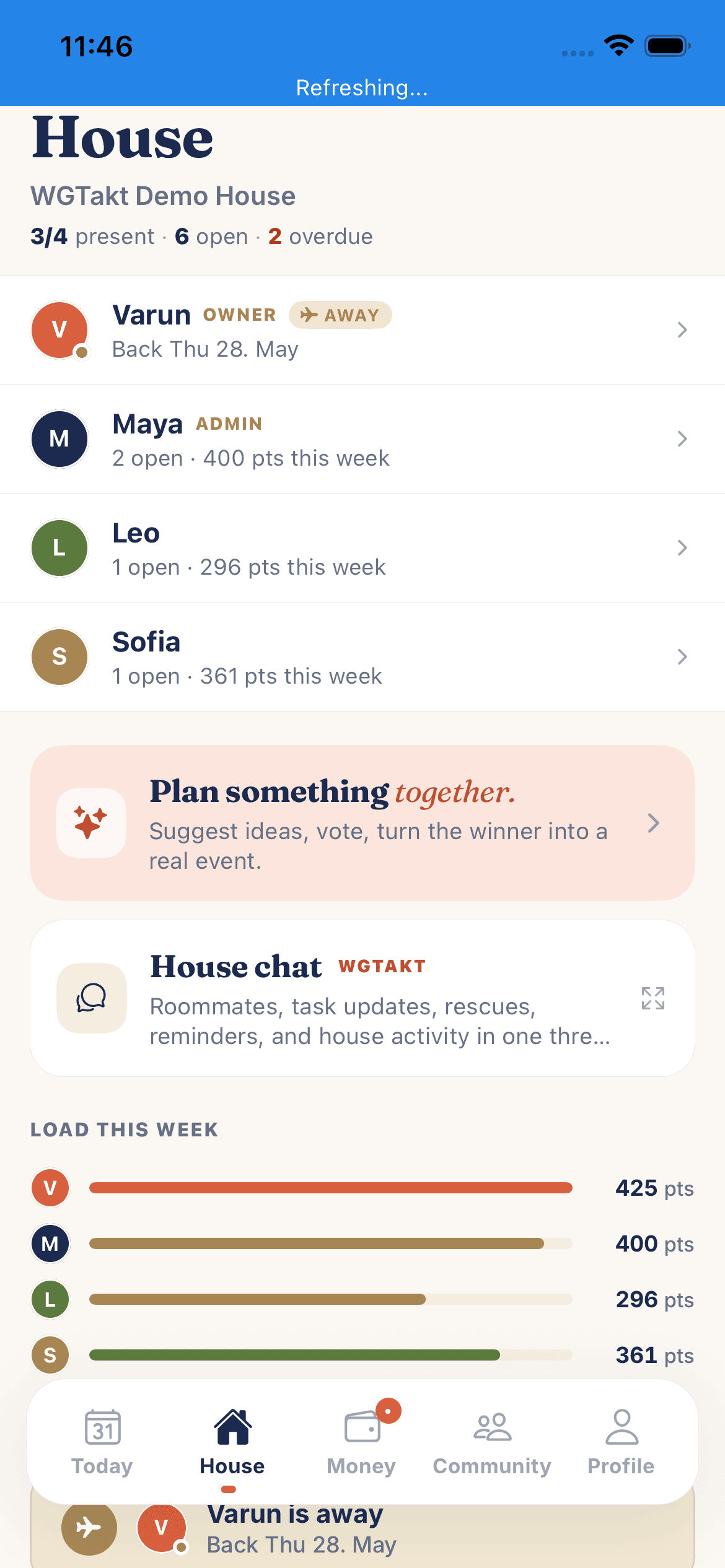
The mobile app took the bot's reminders and moved them into surfaces where a roommate could understand context before acting.
Overdue chores, rescue requests, recent activity, owner avatars, and task rows all come from one idea: action needs social context.
WGTakt Today and house-chat screenshots in the project archive.
Round-robin was not enough
Fairness is not everyone doing the same thing. Fairness is the house adapting when life changes.
Rolling chores, linked dishwasher chains, availability, quiet hours, and weighted points replaced naive assignment.
This is a UX detail most people miss: the visible task row is simple because the scheduler absorbs the complexity.
Scheduler/outbox docs and WGTakt launch gates referenced in the local project archive.
The money layer stopped being bolted on
A WG app without money is only half a house.
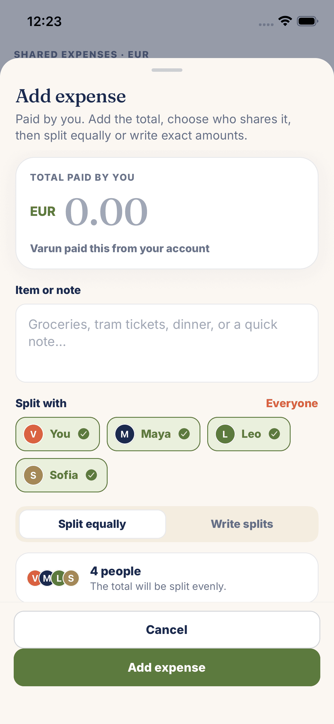
Expenses, shares, settlements, and move-out proposals became part of the same operating model as chores.
The bottom sheet matters: adding an expense feels native because the app treats money as a house event, not an afterthought.
Money and expense-entry screens copied from the WGTakt archive.
The chat tab could not become a trap
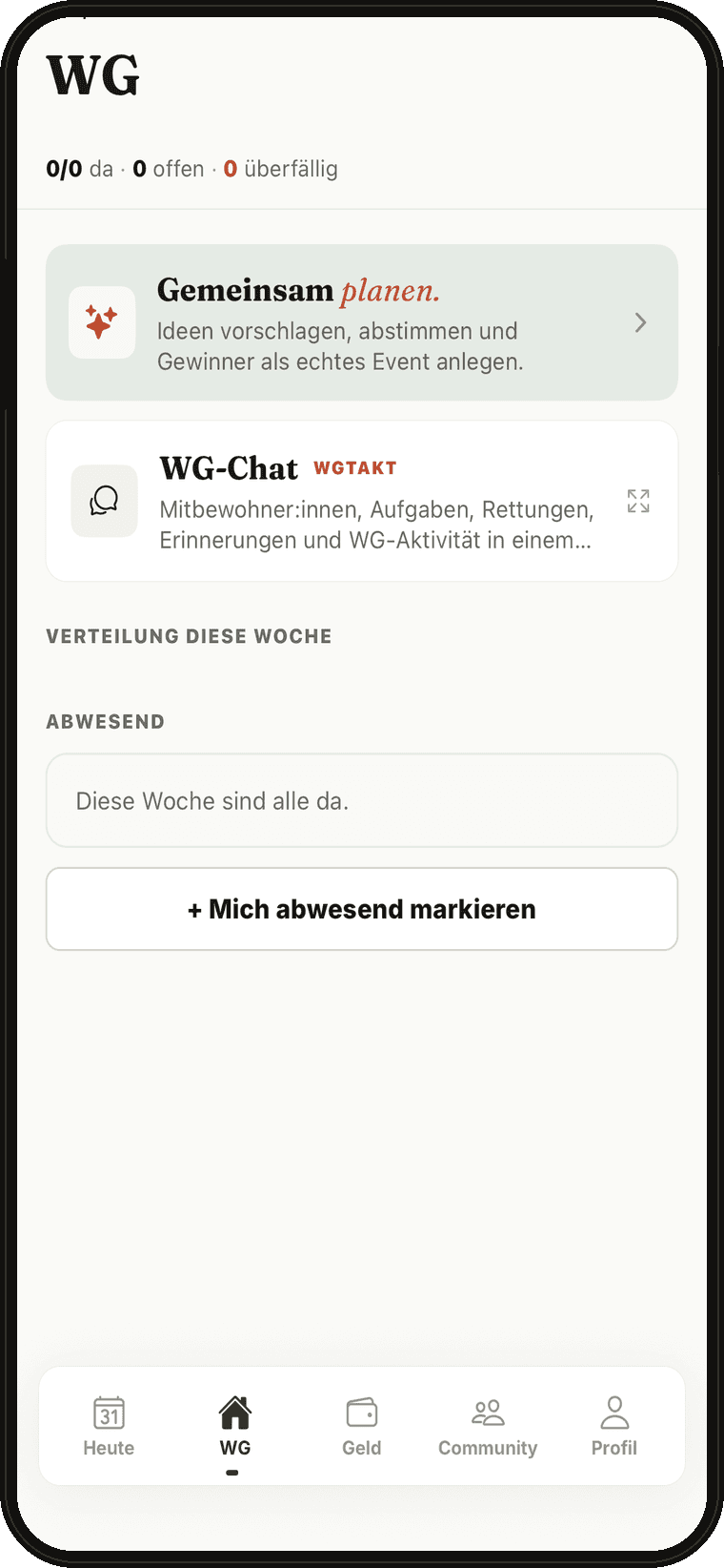
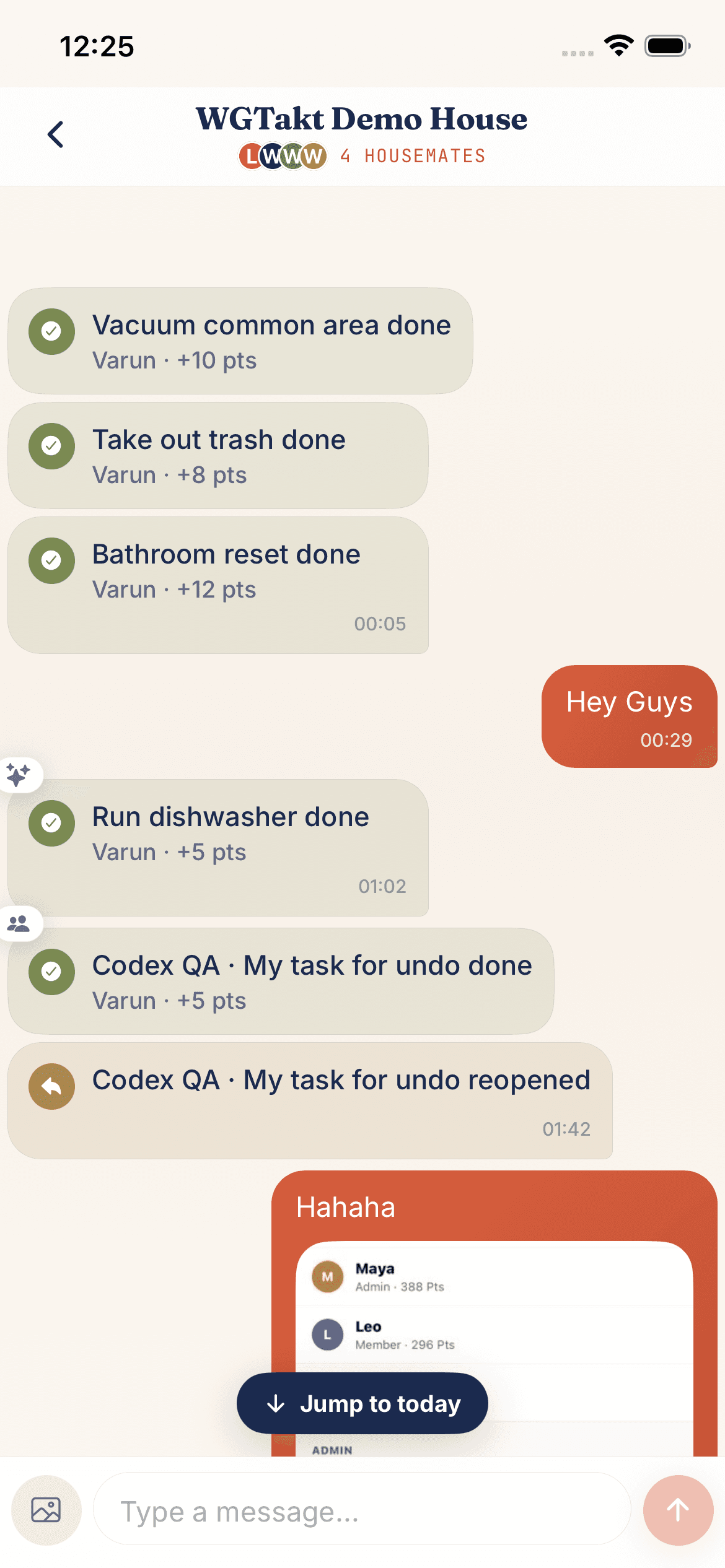
A chat screen can be immersive, but a house app still needs escape velocity.
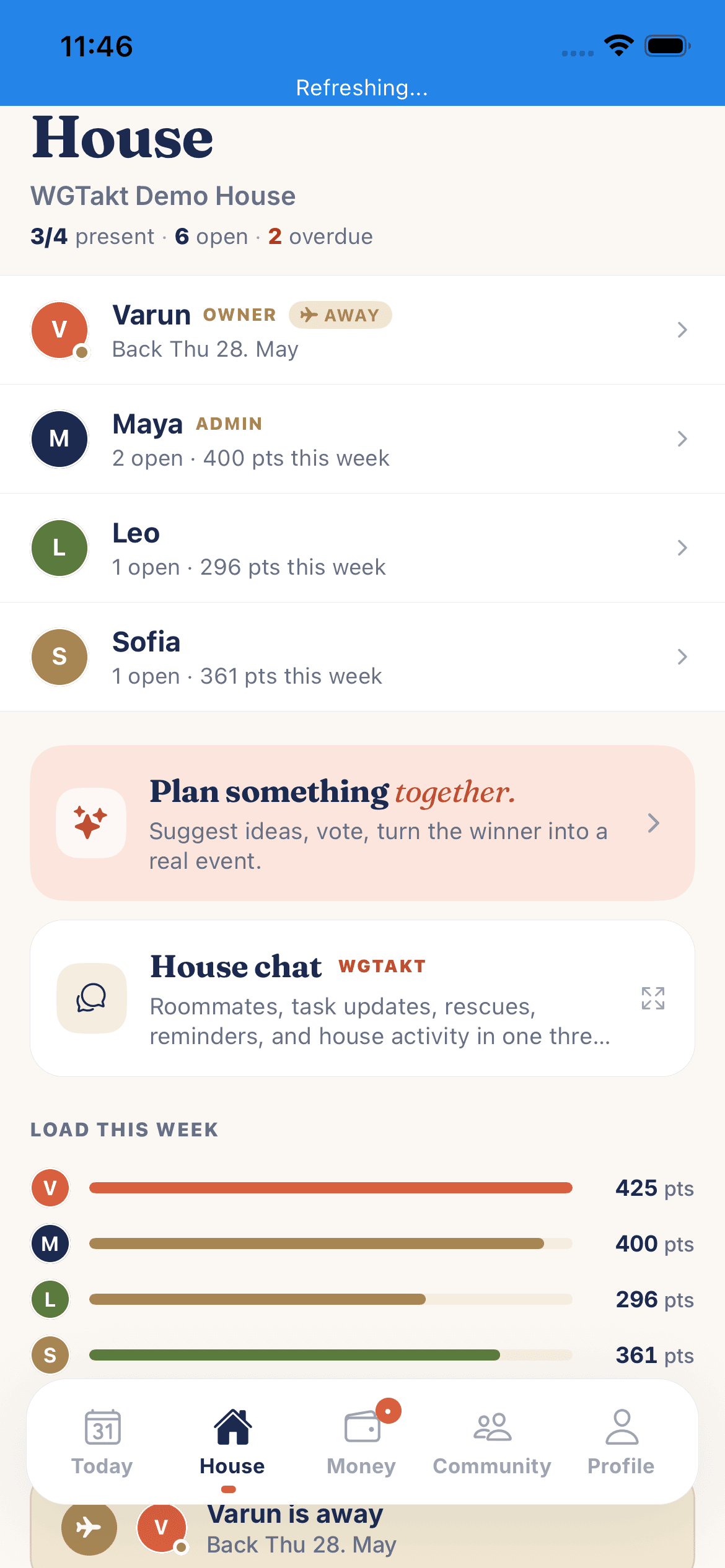
Varun noticed the bottom dock had been shrunk to make room for Chat. The UX felt cramped and made navigation out of Chat worse.
The final model kept Chat as a top-level tab, preserved cached state, and hid the full-size dock only while typing. That fixed the deeper problem without creating a mini tab bar.
the problem with removing the bottom bar in chat is that the UX sucks after and it refreshes and reloads...
Thread prompt and implementation summary from the WGTakt bottom-navigation work.
The app became a story people can inspect
A product is more convincing when the process is visible.
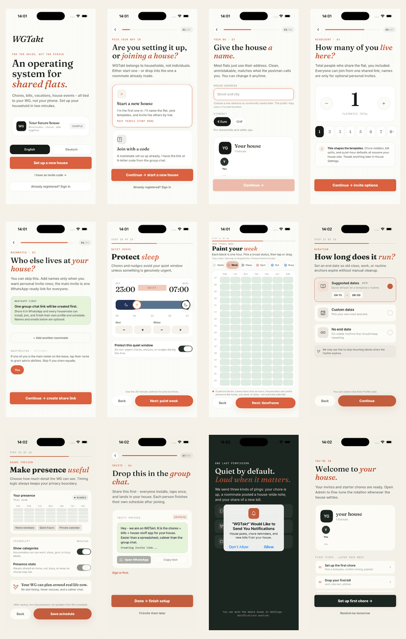
The launch story now shows onboarding, Today, House, Money, Chat, community, and the reasoning behind their shape.
This blog is part of the product: it makes Varun's product judgment legible.
Current emsqre WGTakt article and local screenshots.